Awful includes a powerful, sleek in-game GUI library built entirely from scratch.
You can build a sleek, highly-customizable GUI for your project in minutes, with advanced elements and features like multi-selection-dropdowns, sliders, a powerful independent saved variable system, and more. All baked in and brought to life with just a few lines of code.
Awful UI uses no external textures, and saved variables are handled by awful config, which uses basic filesystem API to store and retrieve settings, so the installation of an addon is never required.
Creating a UI
It's insanely easy. Here's an example UI to get started:
-- RGBA color scheme
local yellow = {245, 235, 55, 1}
local white = {255, 255, 255, 1}
local dark = {21, 21, 21, 0.45}
-- all ui saved variables are stored in `settings`
-- slash command to open the GUI is now `/example`
local gui, settings, cmd = awful.UI:New("example", {
	title = "example ui",
	show = true, -- show on load by default
	colors = {
		-- color of our ui title in the top left
		title = yellow,
		-- primary is the primary text color
		primary = white,
		-- accent controls colors of elements and some element text in the UI. it should contrast nicely with the background.
		accent = yellow,
		background = dark,
	}
})

-- declaring tabs locally can be cleaner
local example = gui:Tab("Example")
example:Checkbox({
	text = "example box",
	var = "test", -- checked bool = settings.test
	default = true
})

-- but you can also access tab objects like this
gui:Tab("Test 123")
gui.tabs["Test 123"]:Slider({
	text = "hi mom",
	var = "mom", -- selected number = settings.mom
	min = 0,
	max = 100,
	default = 69,
	valueType = "%",
	tooltip = "hi mom :)"
})
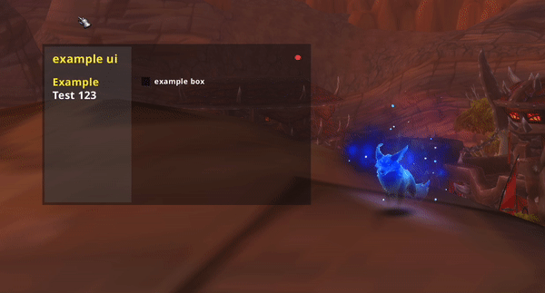
This is what you should be presented with from the above code.
You can now open and close this GUI with
/examplesince that's what we passed as the first arg toUI:New().. Change that to something else and play around with it a bit, change the colors and stuff. Customize it and get familiar. That's the fun part.
UI:New
2 parameters:
1.) The name of your ui (string)
2.) The configuration of your UI (table)
3 returns:
- 1.) The ui object (table), containing the UI frame itself, all awful ui methods, tabs, elements, etc. Mainly it's used to create new tabs, which are your primary source of creating elements.
ui:Tab("Tabname")
- 2.) The list of saved variables (table), a.k.a settings saved by this GUI. You can access them like a normal table by the var option you set for each element. You can also store a reference to this table elsewhere, like in your project namespace.
local ui, settings, cmd = awful.UI:New(...)
if player.hp <= settings.defensiveHP then defensive() end
- 3.) The awful command object for this ui, set up with the name you passed as the first arg.. By default, this slash cmd will open/close your UI. You can additionally use the cmd object from this return to register new slash command callbacks.
Also, all 'un-registered' commands will redirect to
/awful, so users can use your slash cmd to access things like/awful cast->/example cast polymorph focus-- now `/example burst` will call our burst() function! cmd:New(function(msg) if msg == "burst" then burst() -- returning true officially 'registers' it return true end end)
awful.UI:New(name, config) : gui, settings, cmd
Since the config argument is what you'll use to customize the look and feel of your UI, let's go over what all you can configure there:
config
title
So in the example UI config above, we pass title as a string, but you can also pass an array of strings, which will be placed next to each other at the top.
title = {"example", "ui"},This is primarily so you can have a multi-colored title for your UI. To do that, you simply pass a matching array of RGBa colors for each string:
local white, green = {r,g,b,a}, {r,g,b,a}
...
colors = {
  title = {white, green},
colors
awful UI uses red, green, blue, alpha color format. r/g/b 0-255, alpha 0-1.
-- more example color pseudo code
local green = {100, 255, 100, 1}
local white = {255, 255, 255, 1}
local black = {6, 4, 4, 0.8}
...UI:New('example', {
  title = {'example', 'ui'},
  colors = {
    title = {white, green},
    primary = white,
    accent = green,
    background = black,
  },
})
colors > primary
Primary is used for general purpose text in the ui, like element labels, headers and sections. It should contrast well with the background.
colors = {
  primary = {r,g,b,a},
colors > title
To color a single title:
title = {r,g,b,a},Multi-colored titles:
title = {{r,g,b,a}, {r,g,b,a}, ...},
colors > accent
The accent color is used to fill checkboxes, the slider thumb, scroll bars, etc.
colors = {
  accent = {r,g,b,a},
colors > background
The background color
colors = {
  background = {r,g,b,a},
colors > tertiary
The tertiary color is used in both the sidebar and other minor elements like the value labels on sliders.
colors = {
  tertiary = {r,g,b,a},
width / height / scale
You can set the width, height, and/or scale of the UI.
UI:New('example', {
  ...
  width = 350,
  height = 225,
  scale = 1.2
})
defaults are as follows, which makes for a rather compact ui:
width = 325
height = 195
scale = 1
show
If you set this to
true, your UI will open on each load.
defaultTab
By default, when you open the UI it will select the first tab you created. You can choose a different one by passing this variable as the tab name.
-- by default, it would select this tab when first opened
ui:Tab("General")
-- but config below will make it select this one instead
ui:Tab("Information")

UI:New('example', {
  ...
  defaultTab = "Information",
sidebar
You can pass this as false to disable the tertiary colored "sidebar" under the tabs on the left.
UI:New('example', {
  ...
  sidebar = false,
tabs_w
By default, the "sidebar" aka "tabs section" will grow with the width of your title. If your title is super long and you need to limit the width of the tab section and let it overflow, or you just want a different sized tab section, you can pass a specific width with this.
UI:New('example', {
  ...
  tabs_w = 95, -- default is 110
That's pretty much all there is to config at the time of writing this.
Now, let's explore the elements available to awful UI!
Tab
ui:Tabcreates a new tab in the tab section of the GUI, and returns a smart Tab Object which you can use to create elements.
ui:Tab(name)Examples
local ui, settings, cmd = awful.UI:New(...)

--! My tab !--
local myTab = ui:Tab("Mine!") -- this my tab :)
myTab:CheckBox(...) -- blabla, make element

--! Your tab !--
local yourTab = ui:Tab("Yours " .. awful.textureEscape(118, 12, "0:2")) -- >:(
yourTab:Slider(...) -- etc
Group
ui:Groupcreates a new expandable / collapsible folder in the tab section of the GUI, which can contain a group of tabs. it can even be configured to apply new title(s) and color(s) to the UI when a tab from the folder is selected!Returns a group object, which allows you to create tabs in the group via the same method as ui:Tab
local tab = group:Tab(name) -- this tab is in the group
ui:Group(options)Options
Required Options:
name:
{string}, required - the name of the group, which is what will be displayed for the folder (it looks like a tab, but when you click it, expands into a folder of tabs)
Optional Options:
The following options are optional. They're configured the same as they are in UI:New config They will update the title/color/etc. of the GUI when visintg a tab in this group.
colors - config
title - config
Examples
local ui, settings, cmd = awful.UI:New(...)

-- hunter group
local hunterColor = {170, 211, 114, 1}
local hunterGroup = ui:Group({
	name = "Hunter",
	-- UI takes on hunter theme when on hunter tabs 8=D
	title = {"awful", "hunter"},
	colors = {
		title = {awfulCream, hunterColor},
		accent = hunterColor,
	}
})

--! CONTROL TAB !--
local control = hunterGroup:Tab("Control " .. awful.textureEscape(187650, 12))

control:Text({text = awful.textureEscape(187650, 14) .. " Freezing Trap", header = true})

--! DEFENSE TAB !--
local defense = hunterGroup:Tab("Defense " .. awful.textureEscape(53480, 12))

defense:Checkbox({name = "Auto RoS", default = true, var = "autoRoS", tooltip = "Automatically use RoS"})