StatusFrames allow you to display interactive heads-up status information
Calling
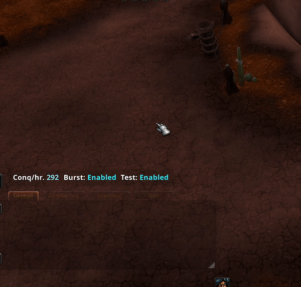
StatusFramewill create a status frame for your UI. It saves its own position separately from your main UI, and has a lock/unlock button for the user to position and lock it where they like.StatusFrame has a growing list of its own elements to display interactive heads-up status information based on your settings in real time.
local ui, ... = awful.UI:New(...)

local statusFrame = ui:StatusFrame(options)
Getting Started
Initial Setup
Create a StatusFrame
ui:StatusFramehas 1 param,options
Optional Options:
The following options are optional, but allow for customization of the StatusFrame.
colors - config :
- there are a few minor differences with colors here:
- colors.enabled is used for Enabled text in Toggles.
- colors.disabled is used for Disabled text in Toggles.
- colors.value is used for value text in some elements
- colors.primary used everywhere else
fontSize
{number}, normal font size for text in the status frame. other font sizes used will scale relative to this one.maxWidth
{number}, max width of the StatusFrame before elements begin wrapping to create a new row.column
{boolean}, pass this if you want all elements to be stacked on top of each other
Creation Example
local statusFrame = ui:StatusFrame({
	fontSize = 12,
	colors = {
    -- transparent bg
		background = {0, 0, 0, 0},
    -- cool blue value text
		value = {30, 240, 255, 1},
	},
	maxWidth = 450,
	-- column = true
})