Awful UI makes it easy to generate powerful elements within your new UI.
Let's go over some of them.
Elements are created using the methods found within tab objects. You create tab objects using
ui:Tab(name), which returns the tab object for that tab. You can then declare them locally or retrieve them fromui.tabs["tab name"]and start populating them with elements using the methods we're about to go over.tab:Checkbox({text="hi", var="hi"})Now there's a checkbox on that tab!
Getting Started
Initial Setup
I'm starting under the assumption you've read everything from the introduction section, and have an understanding of how namespaces work. Most of this will be pseudocode.
gui.lua
local Unlocker, awful, project = ...

-- this is pseudo code, be sure to read "introduction" and configure your gui properly.
local ui, settings, cmd = awful.UI:New('example', {
  ...
})

-- making the settings available to the rest of our project
project.settings = settings

-- and this is the tab I'll be adding elements to
local General = ui:Tab("General")
example.lua
local Unlocker, awful, project = ...
-- now in any other file (spellbook, actor, etc.), we can pull in our settings like so:
local settings = project.settings


-- somewhere in our code:
if player.hp <= settings.healthstoneHP then
  healthstone:Use() -- example blabla
end
Elements
Checkbox
Checkboxes are the simplest form of control, allowing the user to toggle certain things off/on.
value type:
boolean
Options:
text:
{string}, required - the label next to the checkboxvar:
{string}, required - the variable the value of this checkbox will be stored at within your UI's saved variables list.default:
{boolean}, optional - default checked value of the boxtooltip:
{string}, optional - displays a tooltip when hovering the element to better explain its purpose to the user.
Examples:
General:Checkbox({
  text = "Fuhr Mode",
  var = "fuhrMode",
  tooltip = "Enables Fuhr Mode\n\n-20% damage"
})

-- example usage in our rotation
if settings.fuhrMode then
  return StopDoingDamage()
end

-- more examples
General:Checkbox({
  text = "Auto Blink",
  var = "autoBlink",
  default = true,
  tooltip = "Toggles auto blink usage in the routine"
})

if settings.autoBlink then
  blink()
end
Text
Text can be used for a variety of things, from headers that section off groups of elements to create a more organized feel, to creating an entire tab dedicated to explaining macros or other aspects of your project.
Options:
text:
{string}, required - the text to be displayed (hint: you can use texture escapes|cFF<HEXCOLOR>in this strinng to color the text, orawful.textureEscape(spellID[,size, "x:y"])to draw spell textures in your UI.. examples below)header:
{boolean}, optional - sets font to header-appropriate size relative to other elements, and adds a bit more padding on top and bottom to better separate it from other elements.size:
{number}, optional - font size of the textpaddingLeft, paddingRight, paddingTop, paddingBottom:
{number}, optional - adds padding to any side of the textOnClick:
{function}, optional - you can set up a function to be called when your text element is clicked.
Examples:
General:Text({
  text = "General Settings",
  header = true
})

-- lil combustion icon, fires an alert when clicked!
General:Text({
	text = awful.textureEscape(190319, 16, "0:2") .. " Fire Mage:",
	size = 14,
	paddingBottom = 10,
	OnClick = function(self, event)
		awful.alert("You're Fired ;)", 190319)
	end
})

-- padding on the left places element further to the right
General:Text({
	text = "I'm way out on the right!",
	size = 12,
	paddingLeft = 10
})

-- large green colored text, nice!
General:Text({
	text = "|cFF6eff86Big green text, wow!",
	size = 16
})

-- multiple colors
General:Text({
	text = "|cFF6eff86Green text|r, wait.. |cFF43caf7blue text!",
})
Some Text from example above

Slider
Sliders allow the user to select a number from the range you set. This can apply to any number, from health percentages, measurements of time, diminishing return modifiers, etc. That's why you're able to set the
valueTypein the options, to better display what type of value the user is controlling.value type:
number
Options:
text:
{string}, required - the label on top of the slidervar:
{string}, required - the variable the value of this slider will be stored at within your UI's saved variables list.min:
{number}, recommended - minimum value of the slider, the "low end" - defaults to 0 if not specifiedmax:
{number}, recommended - maximum value of the slider, the "high end" - defaults to 100 if not specifieddefault:
{number}, recommended - default value of the slider. defaults tominif not specified.valueType:
{string}, optional - adds this string to the end of the slider's value(s) displayed in the GUI, making it clearer to the user what type of value they're controlling. e.g,ms,%,sec.step:
{number}, optional - allows you to control the value step for the slider - defaults to 1tooltip:
{string}, optional - displays a tooltip when hovering the element to better explain its purpose to the user.
Examples:
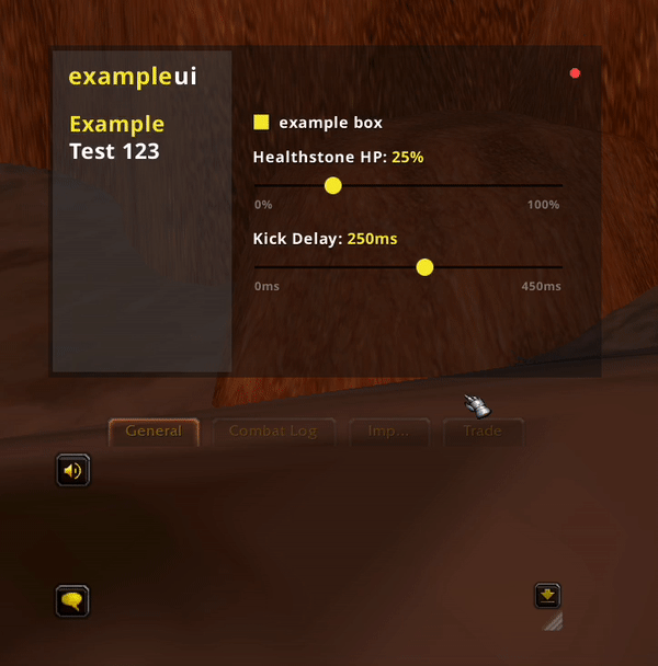
General:Slider({
	text = "Healthstone HP",
	var = "healthstoneHP",
	min = 0,
	max = 100,
	step = 1,
	default = 25,
	valueType = "%",
	tooltip = "HP the routine will use healthstone at"
})

-- in the routine
if player.hp <= settings.healthstoneHP then
  healthstone:Use()
end

-- more examples:
General:Slider({
	text = "Kick Delay",
	var = "kickDelay",
	min = 0,
	max = 450,
	step = 5,
	default = 250,
	valueType = "ms",
	tooltip = "Delay on interrupts from the routine (in milliseconds)\n\nAverage human reaction time is ~250ms. Blablabla."
})

if target.castTimeComplete > settings.kickDelay then
  kick()
end
Sliders from example above
note: values are only available in chat like this because i declared my ui object as
_G.gui
Dropdown
Dropdowns allow the user to select an option from a list of options. Multi-selection dropdowns allow the user to select multiple options from the list. You can easily choose one or the other dropdown types for your application, but the value types are very different between the two.
Dropdown value type:
stringExample: settings.mode == "fuhr mode"
if settings.mode == "fuhr mode" then doNoDamage() endMulti-selection Dropdown value type:
associative arrayExample:
**settings.modes == { ["fuhr mode"] = true, ["example mode"] = true }**if settings.modes["fuhr mode"] then doNoDamage() end
Options:
options:
{table}, required - an array of dropdown options, each containing alabel,value, and optionally atooltipvar:
{string}, required - the variable the value of this dropdown will be stored at within your UI's saved variables list.header:
{string}, recommended - the header on top of the dropdownmulti:
{boolean}, optional - whether or not this dropdown is a multi-selection dropdownplaceholder:
{string}, recommended - placeholder text that will be displayed on the dropdown when nothing is selecteddefault:
{multi: array, single: string}, optional - default selection(s) of the dropdown. an array of values from given options as strings for multi dropdowns, or the one value string for single selection dropdownstooltip:
{string}, optional - displays a tooltip when hovering the element to better explain its purpose to the user.
- Tip: For single selection dropdowns, you don't need both a placeholder and a default. It's one or the other. Right clicking the dropdown will reset it to default, which is no selection if you didn't provide a default. If you did provide a default, it will always have some value, so the placeholder will never be shown.
Examples:
--! SINGLE DROPDOWN !--
General:Dropdown({
var = "mode",
tooltip = "Choose your mode. Can be a lot of test or a little, or anywhere inbetween on the test spectrum.\n\nIf you need any more test, don't hesitate to contact us:\n\n1-800-TEST-123",
options = {
{ label = "Big Mode", value = "Big", tooltip = "Allows you to test big mode without small mode interfering" },
{ label = "Small Mode", value = "Small", tooltip = "Reduces the size of all enabled test modes" },
{ label = "Mode of Tests", value = "Tests", tooltip = "Increase the rate at which you can do tests" },
{ label = "No Test Zone", value = "NoTesting", tooltip = "Stops all of the testing" },
{ label = "Fuhr Mode", value = "Fuhr" },
},
placeholder = "Select your mode",
header = "Testing Mode:",
})
-- example usage
if settings.mode == "Fuhr" then
doNoDamage()
elseif settings.mode == "Big" then
doBigDamage()
end
--! MULTI-DROPDOWN !--
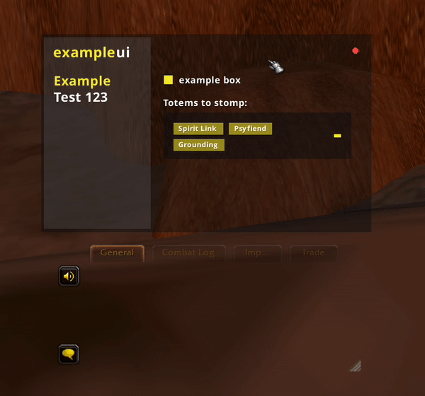
General:Dropdown({
var = "totems",
multi = true,
tooltip = "Choose the totems you want to stomp.",
options = {
{ label = "Grounding", value = 5925 },
{ label = "Spirit Link", value = 53006 },
{ label = "Psyfiend", value = 101398 },
{ label = "War Banner", value = 119052, tooltip = "Stomping banner is useful for getting cc and blabla" },
{ label = "Capacitor", value = 61245, tooltip = "Stomping cap is good, no cap" },
},
placeholder = "Select totems",
header = "Totems to stomp:",
default = {5925, 53006, 101398} -- optional default selections
})
-- example usage
awful.totems.stomp(function(totem, uptime)
-- only stomp from selected totems
if not totem.id or not settings.totems[totem.id] then return end
if fireBlast:Cast(totem) then
awful.alert("Stomp " .. totem.name, fireBlast.id)
end
end)
Multi Dropdown from example above
Sometimes a Spell can have multiple IDs, such as Polymorph due to various Glyphs that can be applied to it. If you don't want to have one entry per Polymorph in e.g. your Interrupt dropdown, then you can do as the below example:
--! MULTI-DROPDOWN WITH MULTIPLE SPELL IDS FOR SAME ENTRY !--
General:Dropdown({
	var = "interrupts",
	multi = true,
	tooltip = "Choose the Spell you want to Interrupt",
	options = {
		{ label = "Repentance", value = 20066 },
		{ label = "Polymorph", value = "Polymorph", tvalue = {118,161355,161354,161353,126819,61780,161372,61721,61305,28272,28271,277792,277787} },
	},
	placeholder = "Select Interrupts",
	header = "Casts to Interrupt:",
  	default = {20066, "Polymorph"} -- optional default selections
})
-- example usage
local function SettingsCheck(settingsVar, castId)
    for k, v in pairs(settingsVar) do
        if k == castId and v == true then return true end
        if type(v) == "table" then
            for _, id in ipairs(v) do
                if castId == id then return true end
            end
        end
    end
end

awful.enemies.loop(function(unit, i, uptime)
    if not unit.casting then return end
    if unit.casting and unit.castint then return end
    if unit.castTimeComplete > 0.3 and unit.castRemains > awful.buffer then
        if SettingsCheck(settings.interrupts, unit.castingid) then
            if counterspell:Cast(unit) then
                return true
            end
        end
    end
end)